Graphical User Interface or GUI, (pronounced "gooey") terminology will be tossed about in the Help resources of the MedSuite On Demand Software. It is important that the you understand this terminology. We will first talk about the visual components of the GUI and then discuss the actions that may be taken on those components.
Component |
Name |
Description |
||||||||
|
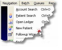
All functions in MedSuite's On Demand Software are available in the Menu system. Menus operate in much the same way as they do in any other GUI application. A menu may be activated by:
|
|||||||||
|
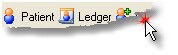
The most commonly used functions of MedSuite's On Demand Software are available from the Toolbar. Toolbars operate in much the same way as they do in any other GUI application. A toolbar may be activated by:
|
|||||||||
|
Buttons allow the user to Add, Edit, Delete, Search, Save, Cancel and many other functions. Buttons generally use speed-keys (of the Alt-Letter variety) The letter used to select a button in underlined on in the buttons description or caption. Buttons may be 'pressed' by:
|
|
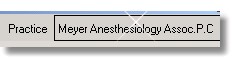
MedSuite's On Demand Software is a multi-practice environment. The user selects a company when logging in to the software. The user should select a 'current' practice to use within the company. The currrent practice may be changed to another practice within the company at any time.
|
|||||||
|
Non-required text entry fields are outlined with a blue border. |
|||||||
|
Text Field - Required |
Required text entry fields are outlined with a green border. |
||||||
|
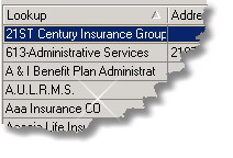
Lookup fields are specialized text entry fields. These fields perform 'lookups' on other dictionaries. Lookup fields are indicated by the binoculars superimposed over a table or spreadsheet icon at the end of the field. If entered, the lookup field forces the user to select a valid dictionary entry.
The lookup function may be invoked by:
|
|||||||
|
Lookup Field - Required |
Lookup fields may be required entry fields. Required lookup fields are outlined with a green border.
|
|
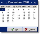
Date fields are specialized text entry fields. These fields perform date lookups. If information is entered, it must be in the form of a valid date in MM/DD/YYYY format. The date field automatically handes the slashes in the date. Date fields are indicated by the calendar icon at the end of the field.
Date fields may be entered by:
A two digit year may be entered by the user. If the date entered has a two digit year, the year will be resolved to a four digit year as follows:
|
|
Time fields are specialized text entry fields. These fields perform time lookups. If information is entered, it must be in the form of a valid time in HH:MM format (24hr clock). The time field automatically handles the colon in the time. Time fields are indicated by the scroll arrows icon at the end of the field. Times may be entered by:
|
|||||
|
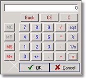
Calculator fields are specialized text entry fields and are indicated by the calculator icon at the end of the field. These fields allow the user to enter numeric digits into the field either by keying the digits into the field or by invoking a calculator, peforming the calculations, and "pasting" the results into the text entry field. The calculator may be invoked by:
The results of the calculation are then pasted into the amount portion of the field.
|
|
The radio button indicates true/false values. Radio buttons are always used in groups of two or more. The radio button 'group' is always surrounded by a box that is indicated by a dark-grey border and optionally a caption or description. Only one radio button in a group can have a "true" value at any given time. When one radio button is toggled "on" or "true", the rest of the radio buttons in the group are automatically toggled "off" or "false". Therefore radio buttons are used in "OR" situation (A or B or C).
Radio buttons may be 'toggled' on by:
|
|||||||
|
|
The checkbox indicates true/false values. Unlike the radio button, each checkbox is operated independently of other checkboxes and of radio buttons as well. Therefore checkboxes are used in "AND/OR" situation (A and/or B and/or C).
Checkboxes may be 'toggled' on by:
|
||||||
|
The drop-down list field is used to allow the user to select from a list of specific values. MedSuite generally uses the Lookup Field rather than drop-down lists. This is due to the fact that Lookup Fields are more flexible the drop-down lists. There are a number of instances where drop-down lists are appropriate and are used. Values in a drop-down list may be selected by:
|
|
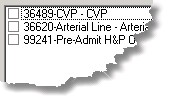
The Data Grid is used to enter and display data. A data grid is difficult to use for data entry purposes, but provides an display and formatting capabilities. As a result, MedSuite uses the grid for display purposes only.
An item in a grid is 'selected' by:
When selected, a grid row will be displayed as white text on a blue background.
Any grid may be sorted by clicking with the mouse on the column to be sorted. An arrow in the column heading indicates if the sort is ascending or descending.
Some grids are customizable, allowing the user to add or remove the displayable columns by right-clicking on the grid and using the pop-up menu. In addition, these customizable grids also allow the user to modify the sequence in which the columns appear in the grid by clicking and dragging the column(s) into the desired order.
|
|||||
|
The CheckList is a list of checkboxes. Items in the list may be toggled on and off by:
|
|
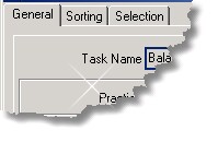
Tabbed Dialogs contain items related to a specific function that generally fit into logical categories and will not fit on a single form or window.
|
|
|
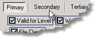
In a few instances, MedSuite's On Demand Software has a tabbed dialog within a tabbed dialog. Sometimes, there is just no avoiding this problem. The tabs-within-tabs is indicated by what appears to be buttons separated by a short vertical line. These 'buttons' are, in fact, a specialized tab.
|